The year 2022 was when AI-generated images went viral. Online, you may have come across very realistic yet suspiciously improbable images of, say, an astronaut riding a horse through space or an avocado doubling as an armchair.
Numerous new generators – including Dall-E, Midjourney and Stable Diffusion – offer anyone with an internet connection the chance to conjure up their own strange apparition, simply by typing in a “prompt” for the AI. (For example, “astronaut astride horse on Mars”. Or, for this article, “Mark Rothko Abstract Expressionist oil painting” – yes, the image above isn’t a real Rothko.) The possibilities have been endless, the opportunity for meme-making infinite.
It should not be surprising that a great many artists who have spent a lifetime honing their skills are a little put out by this latest disruption. Are companies going to keep hiring designers when they can produce prototypes themselves for free? Will budgets stretch to include animators if their hand can be imitated from a simple text description? Advocates of AI have insisted that creatives should have nothing to worry about and can adapt their process to incorporate or work around technological advances, much like the modernists did with the invention of photography.
But if those historical greats were alive and working today, would they also be watching their backs? And could a computer ever hope to reproduce the emotional depth that gives great art its charm and meaning?
To find out, we set a challenge for three art experts: Bendor Grosvenor, art historian and presenter of the BBC’s Britain’s Lost Masterpieces; JJ Charlesworth, art critic and editor of ArtReview; and Pilar Ordovas, founder of the Mayfair gallery Ordovas. Each was invited to look at pairs of artworks of a similar style and period over Zoom to see if they could tell which was generated by a machine. All three admitted to finding it tougher than expected …
Nineteenth-century landscape
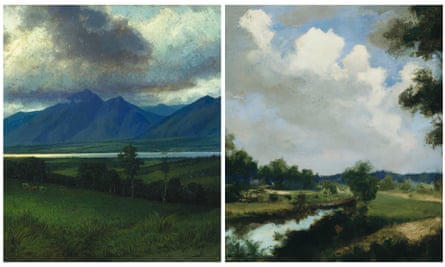
Bendor Grosvenor “When authenticating a painting, composition is usually the last thing I would look at, after brushstrokes and condition. The one on the left looks like New Zealand, with the cows a bit plonked in and the grass not particularly well painted – but I quite like the way the light falls on the hills. There’s something about the picture on the right that looks a bit too good to be true. It’s got the bright, contrasty clouds of a Constable and the winding river reminds me of the French Barbizon school. If you asked a computer to make a Constable, that’s probably what it would come up with.”
Verdict: correct “I think the AI image is quite impressive, actually. It’s like a blend between a Corot and a Constable. I can’t even draw a smiley face so take my artistic input with some scepticism, but I would say it needs a figure or a little boat to give it a focal point.”
JJ Charlesworth “Landscape can mean a lot of things from a lot of places, and there’s also the matter of whether it’s good. On the painting on the right, there’s something a bit confused at the edges and I’m not sure where the river goes … but then some painters wouldn’t have been too bothered about that. The left one seems to recall the American grand landscape painters. The foliage is weird at the front but the mountains have a humidity haze, there’s the cows and a little ship puttering away. My hunch is that the left one is real, by a very conventional painter who understands the codes of the genre.”
Verdict: correct “The modernist artists privileged compositional coherence with a degree of lyricism. It’s easy for critics to detect when someone is doing it badly, but the machine doesn’t notice. That tree in the middle is clumsy and I don’t know whether a painter interested in how to put together a picture would have done it.”
Pilar Ordovas “In real life, I would always look at the surface and the application of paint and would never judge an artwork from an image on Zoom. The one on the left doesn’t feel real to me but, then again, I’m sure there is a landscape that looks like this somewhere in the world. With the one on the right, I can feel the water, the trees and the air, whereas the above painting just feels flat to me and pixelated, so I think it’s fake.”
Verdict: wrong “I wouldn’t normally give judgment on a painting without viewing it in real life. I look at the right-hand picture and think of Corot and a number of other artists, so that’s what it’s done, right?”
Abstract expressionism
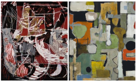
BG “Even if these were two genuine works I wouldn’t know where to begin. I can’t think of anything interesting to say about either of them. One is probably an extremely famous thing that I should know about but I’m so rubbish on abstract art. I would go for the AI one being the squiggly one on the left because I feel there’s something a little bit digitised about some of those scratch marks to the right. The picture on the right feels like the product of … oh, I don’t know! Yes, I’ll stick with the one on the left being the AI.”
Verdict: wrong “Well, the one on the right is better than the one on the left in my opinion. I don’t really have that kind of thing on my wall but if you offered me the choice, I would actually go for the AI one. There’s something slightly pleasing about the colours and shapes, a bit like a Ben Nicholson.”
JC “Abstraction is obviously very anti-conventional and isn’t anchored in figuration, so you have to assess each one on their own merits. There’s actually more diversity in the left one, there’s a deployment of these scratch marks that is quite complicated … Put it this way, I find myself more drawn to it. The elements are speaking to each other more so it seems to have a motive. The right hand picture is pleasant enough but there is less structuring principle so, if it were by a human, I would struggle to care much about it.”
Verdict: correct “With this genre it’s very hard and the idea of cohering logic is important. Most abstract paintings come from a debate about what’s necessary in the mind of the artist, rather than what’s arbitrary. The one on the left seemed more subtle, but could be simulated from having seen too many Cy Twomblys.”
PO “I’m not sure about the shapes and the lines in the image on the left, but it does make me think of very early Pollock, though less colourful. The one on the right could relate to many early works from some of the abstract expressionists or, perhaps, Tancredi and certain Italian artists from the 1950s and 60s. I’m sure the AI is looking at these existing works in order to create something based on them but I would still say the one on the right is real.”
Verdict: wrong “When it’s not by a particular artist you know very well, it’s much harder to determine what feels wrong. With a specific artist you look at how they worked at a particular time, their colours, their compositions and what the feel of it should be. If it could be any artist, it’s a bit random.”
Dutch still-life
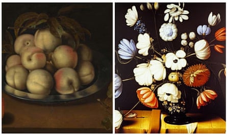
(Right)
An image generated using Stable Diffusion with the prompt “Dutch old master still life flowers in vase on table dark black Bosschaert”. Composite: Ambrosius Bosschaert/National Gallery Prague; Image generated by Jo Lawson-Tancred and Philip Booth
BG “The plate of apples on the left looks like an Adriaen Coorte – quite sophisticated and I like the reflection on the plate. The flowers look quite simplistic and the petals don’t quite work but I think you’re playing a bit of a trick on me here … because you can get still lifes from the period that look quite clunky and that’s part of their appeal. So it’s very tricky! The image on the right is full of what you would want to describe as deficiencies: the tablecloth looks like a bit of folded-up cardboard. However, I think it might be genuine because I can see cracks on the surface that I don’t think the AI would put there. If it has, it’s very, very clever.”
Verdict: wrong “Really? Wow, I didn’t know it could do that. Well that’s very good.”
JC “The right one looks familiar. You get the over-stylised flowers in quite a number of still lifes. The bland apples, or pears, whatever they are, on the left … I think there’s a rather clumsy idea of which side you put the red on and I find them rather lifeless and dull. There is too much attention on the reflection on the plate, the colouration seems wrong and I’m not sure why the leaves are so decayed. It could be an artist who nobody bought very much of because he was depressing. On a snap judgment, I’m inclined to say that one is fake.”
Verdict: wrong “Well, there are a few alarm bells. There’s a slightly confused moment where that red flower on the left is curling off a stem that seems to connect with the blue one. These paintings were aspiring to realism before the existence of photographic realism, so there is often a peculiarity in pre-photographic painting.”
PO “The picture on the right looks more like a Dutch still life for me with the flowers. The colours are not quite right but it could be a terrible reproduction. The one on the left looks more Spanish than Dutch to me. The imperfect leaves on the pear are really good, as is the shadow on the plate, so I think that one is real. Still lifes are all about symbolism and the fragility of life, with the wilted leaves sort of eaten up. It relates more to what the artist would have been interested in then.”
Verdict: correct “The work on the right just feels empty of all the meaning that you would expect to see in this period. Still life is not just a beautiful vase of flowers or fruits, it’s actually laden with feeling. With abstract art it’s much more random, so with that it may be harder to make a judgment.”
Impressionist scene
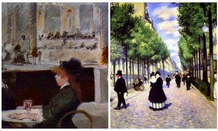
BG The image on the left, from what I can see, is quite spontaneous and creative. I can see sketchiness and the canvas is showing through, whereas the one on the right looks a bit glossy. I’m a little suspicious about the cobbles, they look off as does the tree – or the lamp-post, is it a lamp-post? – on the far right … I want to say the image on the left is genuine but who is the woman talking to? It looks like a splodge. I’ll go with it being human made just because it feels a little bit more rough and ready.
Verdict: correct Well I should know what a Manet looks like, but at least I figured out it was by a human! The picture on the right is almost a little bit too good to be true, like the computer’s trying a bit too hard to do a Pissarro or something like that.
JC The one on the right is too orderly, it strikes me that the depth is a little bit obvious and the trees are too repetitive. It feels like an image that understands 3D modelling rather than looking. The one on the left has all the curious incoherence of impressionist preoccupations – blurred distance, indifference … These are human values that have a certain pathos to them and I just don’t get that in the other one. Typically, the street scene was about time, place and boredom, but this seems to me to be prosaic, there’s no attention to anything and quite a banal mood.
Verdict: correct Creating a sense of attention is not simply a matter of understanding figures and orchestrating them formally, there’s also these quite intangible issues of mood, place and emotion. That doesn’t necessarily mean it couldn’t have been an image generated by an AI trained on Manet.
PO With impressionism, the surface would tell you everything. However, in the work on the right the colours look off to me and the whites are really, really white. You can hardly see the faces in the foreground. Sometimes with avant garde art you do get odd colours but they make sense and have emotion. This has no depth and the figures look a bit floaty. The composition on the left is very different. It looks like it has a pastelly finish, which may be the AI imitating pastel but there is something that rings more true.
Verdict: correct It’s interesting how in the picture on the right, the two figures near the front are almost faceless but in the image on the left you see a face, so it feels human. I am surprised, I thought these comparisons were going to be more obvious but they weren’t at all in some cases.